SHARE
in social networks
Properly selected colors of a kitchen is not only uplifting, but also can affect eating habits. When choosing a color combination in the interior of the kitchen, you need to follow personal preferences. It is not always seen in the Journal of the finished design is suitable for your particular room. To choose suitable colors also influences the style in which formalized a house, because the kitchen should be a harmonious continuation of the interior.

picking color design for the kitchenIn the first place should stick to personal preference
Content
-
1 How to determine the color of the kitchen: the color combination in the interior
- 1.1 The combination of colors in the interior of the kitchen: basic principles
- 1.2 The basic rules of colors for the kitchen: what designers recommend
- 2 How to choose the color of the walls in the kitchen that need to be considered
- 3 In what color to paint the kitchen, which is characterized by a large area of
- 4 How should look bright kitchen: a combination of shades
- 5 Black and white colors of the kitchen: a photo of the original examples
- 6 Turquoise kitchen: how to combine colors
- 7 Red and orange colored kitchens: design examples
How to determine the color of the kitchen: the color combination in the interior
Designers believe that from what color to choose kitchen depends on the overall atmosphere of the space. That color is considered an effective tool that can make the room look unusual and attractive. Of course, to choose the coloring cuisine - is not the same thing as to perform alterations, but still well-chosen colors will help to correct not the most successful plan. Some designers tips on choosing colors for the kitchen to help visually expand a small room and raise the height of the ceiling in the small kitchen.

With the correct color can give the kitchen the right atmosphere
Important!The harmonious combination of light and dark shades, cool and warm color will create visual illusions that affect visual perception of food.
When choosing colors there are long-known principles. So, the choice of light colors will visually enlarge even a small kitchen, and dark colors conceal area. Therefore, to understand how to choose the color of the kitchen, you need to decide what effect I want to achieve in the design of the room. For example, if you want to visually increase the height of the ceilings, the method of contrasting bright ceiling dark floor that looks "heavier". If you do the opposite, the ceiling will be much lower.
Likewise possible to make the room larger, visually apart walls. To do this, use a light color for horizontal surfaces and darker shades - on verticals. For these reasons, a combination of colors in the kitchen is recommended to choose depending on the room size, shape and height of the ceilings. For basic kitchen design principles are as follows:

Designers do not recommend to combine shades of warm and cool color in one room
- To create a design small kitchen preferable to use pastel shades. In this case, the bright colors are allowed to use as accents.
- If the kitchen is large and does not need to save space, it is advised to give preference to saturated and bright colors.
In general it can be noted that there are no clear rules, which define the color gamut of the kitchen, because each person has their own ideas about their favorite colors. But still, if you choose the specific shade you need to become familiar with its features and decide whether it was appropriate to use it. For example, psychologists have long proven that the use of cool colors helps reduce appetite, relaxing effect on the nervous system. The most characteristic cool colors are as follows:
- shades of blue and blue;
- green;
- Gray;
- burgundy;
- turquoise;
- the black.

If kitchen area is large, it can be done in bright colors and dark
Warm colors, on the contrary, favor the increase of appetite, a positive effect on the digestive system, energize and invigorate. The characteristic warm tones range include the following:
- red;
- yellow;
- Orange;
- lime;
- shades of brown;
- purple.

Light colors make the kitchen space visually larger and the ceiling above
The combination of colors in the interior of the kitchen: basic principles
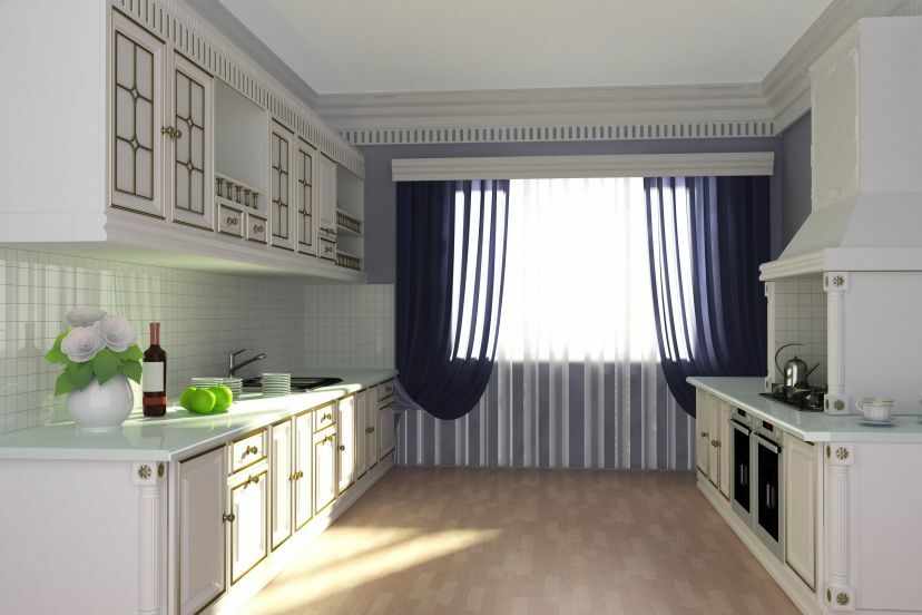
The color scheme of the kitchen are two versions: monochrome and color. Monochrome interiors are rarely used in the regeneration of kitchens in the apartments, because such uniformity in coloring will have a positive impact on the psychological state of man.
Monotonous environment is able to immerse the person into depression and cause mood apathetic. Therefore it is better to dilute the main color of the kitchen extra tinge. For example, it is possible to lay floor tile according to the type of a chessboard. To set the mood in a prominent place cost to install a bright accent element, animating the space.

White is perfectly in harmony with any colors and shades
Useful advice! Before you finally decide on the color of the kitchen, it is best to select 3-4 favorite version, and a few days to review them. In this case, it will be easier to make the right choice.
Colored dishes are created by combining different shades of one scale. It is important to adhere to the principles of good color distribution. Usually in such kitchens it is used up to three shades. Main color that has been chosen as the core, should occupy 60% of all surfaces on share the second color significance is allocated 30%, and the third should not be used by more than 10%.

That the kitchen looked harmoniously, do not use too many colors
Adhering to such percentage of the combination of colors in the kitchen, you get to create a harmonious space, which does not hurt the eyes and excessive diversity alyapistostyu. At the same time, to intelligently combine all shades, you need to become familiar with the color wheel, that shows the correct color registration.
The basic rules of colors for the kitchen: what designers recommend
Everything for the kitchen, you can choose any colors, as long as they pleased all the tenants. It should be remembered that after the bedrooms kitchen is considered the most haunted bathroom, so its design should be approached cautiously and slowly. Before deciding on the right color for the kitchen, you need to familiarize yourself with the following rules:

If you choose a bright kitchen, the finish must be neutral
- If the execution of an option has been selected in the space of a few colors, no preference should be given more than three shades, so as not to lose the basic design intent.
- If the shade of the color of the walls and facades of the kitchen match, the furniture you need to choose a few shades darker.
- Floor and ceiling are advised not to perform in the same color and texture. This technique will break the balance of the room volume.
- Kitchen apron and worktops in colors opposite shade of kitchen furniture and dining group. With the help of contrast detail you can correct accents in the room.
- In that case, the unsaturated kitchen milky or her design was chosen pastel tones, the accents are created using saturated colors, which must be fulfilled walls, curtains and upholstery furniture. This will help make the room more interesting.
- In the kitchen with bright walls set executed in a more soothing colors that will not attract attention. Conversely, if the bright facades of cabinets, the walls should be done in pastel colors.

The kitchen is not recommended to do the floor and ceiling are the same color
At the time of renewal of the kitchen gives the impression that to find the right color - an impossible task, but if review key combination rules, it is possible to mention a few embodiments liked that was from plenty to choose from.
Table of combinations of colors in the interior of the kitchen:
| base color | Possible options combinations |
| White | Universal color that goes well with most colors, but it is best in harmony with the blue, red, gray and black |
| Beige | Suitable for white, coffee, brown and blue |
| Red | Depending on the saturation of the color is well combined with yellow, black, blue and green |
| Pink | Harmonizes with brown, olive, turquoise and gray |
| Orange | To him fit shades of blue and blue, purple and lilac |
| Green | Well complemented by yellow, black, beige and golden shades |
| Blue | Suitable for red, gray, white and yellow colors |
| Gray | Gray in the interior of the kitchen itself make the space boring, so it is diluted with pink, red, blue and purple tones |
| The black | Universal classic color, which is acceptable to combine any shades. Black kitchen interior it is best to dilute with a green, white, red, orange or yellow |
How to choose the color of the walls in the kitchen that need to be considered
Before you decide what color to paint the walls in the kitchen, you need to take into account such parameters of the room:
- size and configuration;
- ceiling heights;
- presence of windows and their size;
- to take into account which side of light out the window: the south-west side is considered to be more illuminated than the northeast.

Choosing a color for the walls in the first place must take into account the dimensions of the kitchen
If the kitchen is distinguished by the presence of two free wall, you can finish in different colors, with permissible to divide each of the walls into two parts with different shades, using horizontal or vertical division. In the kitchen, where there are dark corners, they need a good highlight, or used to furnish light colors. If the kitchen has a bay window (the protruding part of the room), then the adjacent walls should be light.
Related article:
Interiors Kitchen: Making the kitchen is not only convenient, but also attractive
Ideas to create a harmonious space. Various styles, especially planning and selection of furniture set. Photos cuisines.

In a situation where the furniture in the kitchen are arranged in a circle, the surface between the tiers of cabinets, as well as kitchen apron is recommended to perform in bright colors, to prevent the creation of a closed space. Window opening can be visually expand, if the horizontal surfaces around the issue in white. Thus the room can be made lighter.

If the furniture light and monochromatic, the kitchen walls are allowed to make bright
When it comes to the design of the narrow kitchen, then in this case, for the walls are advised to use light colors. Furniture in a narrow room should not "merge" with the walls. For example, if the walls are light gray, the furniture is better to choose a white facades. Wooden light furniture will look good if the light brown color of the walls for the kitchen has been chosen.
Important! The walls are narrow and elongated kitchen can not be painted in two colors, as in this embodiment, design space will become even more irregular and elongated shape.
Kitchen space, which is characterized by low ceilings, makes people a sense of discomfort, a feeling of heaviness and stiffness. If we choose the right color of the walls, it is possible, at least visually correct this defect. The main points to be followed in the design of a low kitchen:


- painting of walls or wallpapering should be close to the ceiling;
- use the vertical bar in the finishing of the walls;
- if the pattern is present on the wall, continues on the ceiling, then its height is increased significantly;
- the ceiling should be a little lighter than the other surfaces, but not necessarily white.
Bright cold tone visually increase the height of the walls. Therefore, if the room is low, it is desirable to perform the kitchen in blue, while the wall is recommended to leave the self-colored.
In what color to paint the kitchen, which is characterized by a large area of
Large kitchens do not need a cold and too bright colors. If you view the photo colors kitchens, with large areas, we can see that the most commonly used natural colors under a tree, orange, cherry and coral shades. White and brown kitchen is also considered one of the most popular options in large rooms.
Color facades kitchen units should be in harmony with the shade of the walls in the room, especially in the spacious kitchen, where there is an opportunity to establish a large number of pieces of furniture. If light wood furniture has been selected, it is desirable to combine with walls apricot or cream color. When dominated by glass facades and chrome details, the wall will approach the red, magenta or violet shade.

Large kitchen can be designed in any color, as long as all looked harmoniously
The spacious kitchen is also not recommended to use a lot of white color, which visually enhances the space, since you can get the effect of a large uninhabited space. In this case it is appropriate to be a light-blue walls, against which well look light brown or texture of wood facades.
Useful advice!The kitchen, which has the color of natural wood, always looks comfortable, both in a private home or apartment.
Other basic rules of selecting the colors of the walls are the following:
- The presence of a large ornament or picture on the wall visually make the room smaller. In this case, a fine figure, by contrast, fills the volume of the room and makes it visually more.
- Geometrically, regular shapes in the kitchen walls, such as squares, bands intersecting, create the effect of a continuous space.
- The presence of a vertical pattern visually increases the height of ceilings and kitchen dimensions as a whole. Horizontal lines and stripes visually reduce the height of the ceiling, but make wider walls.
- Picture diagonal lines creates a dynamic image, which causes the effect of motion.


How should look bright kitchen: a combination of shades
Kitchen pastel colors always looks comfortable and harmonious. A combination of several bright colors makes it possible to visually expand the room and fill it with the missing light. Studying the photo light dishes in the interior, we can see that the larger the area, the lighter the shade chosen for her. Rich colors in this case only used to highlight accents. Mainly bright colors highlight the tabletop, kitchen apron and accessories, including lamps.
In most cases, the interior light kitchens there is a combination of such colors as white, beige, and yellow. The advantage of this variant is considered that the combination is suitable for any style of decoration. Another popular solution is to combine in the interior of the blue kitchen, yellow and lavender flowers, which are more suitable for creating a light and airy kitchen in the style of Provence.
If you want to arrange the room, which opens onto the north side, and deprived of natural light, designers recommend to give preference to yellowgreen kitchen - these colors will warm the space and fill it with humor. On the Internet you can find interesting photos yellow kitchen interior.

The kitchen is decorated in light colors looks comfortable and harmonious
When you want to perform a bright kitchen, you need to choose a base color and use it in the design of large-scale surfaces - walls and gender. The second most important color is applied for painting facades of kitchen furniture and dining groups, and most vivid shade used to extract medium-sized parts, such as carpet, or apron worktop.
Important!Worktop in any case should not be performed in a single color with an apron.
The most popular styles that are suitable for light dishes include:
- Classical. Style is characterized by restraint in detail and shades. For classic cuisine is unacceptable to use a large number of bright accents.
- Modern. Light kitchen in this case designers recommend dark shade surfaces of kitchen furniture, using shades of brown, purple or black. Allowed application contrasts.
- High tech. Direction prefers monochromatic kitchen interiors. Most often, the kitchen is done in gray, silver or white. The interior is important to use color stainless steel - will be especially look good steel worktop.
- Scandinavian. Characterized by the presence of beige, gray and white tones. The most important look surface made from natural materials.
- Pop Art. Style characterized by bright kitchen, which is diluted with bright elements. In this case, it is quite possible that kitchen in white will present a bright red kitchen or other furniture of the same color.


Black and white colors of the kitchen: a photo of the original examples
black and white combination has long been traditional, but if you want to make a black base color, the design of a kitchen is much more complicated. In this case, there is a risk of creating too gloomy and dark interior. If you view the photos of kitchens, the color most often used in a proportion of 60 to 40%, with most of the given white shade.
However, in the design of such facilities is also not advised to overdo it with the white color because black can easily get lost in the abundance of light - and the contrast feeling disappears.

If the kitchen is small, the white should be significantly more than black
Useful advice!The best way to design black and white kitchen It is considered an option when the walls and ceiling are in a light color, and the floor - dark colors. Upper facade is better to make a light, and the lower is acceptable leave black. The table top can be light, and an apron for the kitchen - black and white.
Another important point that needs to be taken into account, it is believed that black color more easily soiled, because on glossy surfaces fingerprints, better smudges and dirt. Therefore, studying a photo of kitchen fronts in black and white, you can see that the high-gloss surfaces are less commonly used, and preferred embodiments of textured wood that is not as fast They get dirty. Other helpful tips on a two-tone design of the kitchen:

The kitchens in black and white colors look good, metal and wood parts
- The ceiling in black on a background of white walls seem visually above, but this method is considered to be sharp. Softer option would be light-colored walls and ceiling combined with the subfloor.
- If you choose kitchen furniture in white and bright choose wallpaper for black-and-white kitchen, with apron to make a dark, such a room saturated with the volume and creates the effect of presence in the niche wall.
- If all the walls in the kitchen, but one of the paint in white color, the space will visually appear larger.
- Laid on the floor on the diagonal black and white square tiles visually expand the volume of food.


Turquoise kitchen: how to combine colors
If you view the photo turquoise kitchens, here you can find many colors - from rich navy blue to pale azure. Such marine motifs considered relaxing. If you select more than cold blue tones, the room will seem cooler and if prefer more saturated turquoise, the kitchen atmosphere becomes warmer. Turquoise alternative design is used most often in the design of kitchens in these styles:

Kitchen turquoise can be diluted with white, gray or red hues
- Provence. Used gray-azure facades, which are combined with pastel wallpaper. A distinctive feature is considered to use a little faded surfaces.
- Country. In this case, the recommended more vibrant turquoise colors that are used for finishing the apron, and other surfaces. Well in the interior combine white and green and even black and white shades.
- Minimalism and high-tech. Before you choose the color of the kitchen units according turquoise interior in the style of hi-tech, it is necessary to understand that preference should be given a glossy façade.
A good option - white and turquoise kitchen, when the background of the white walls looked magnificently azure headsets. This solution is perfect for decorating small kitchens. Another standard combination is a combination of gray and turquoise. Particularly relevant for this tandem modern kitchens, where there is a large amount of chrome. Your best option is to use a modern interior graphite gray furniture, which is set against the background of light blue trim. In the pale blue ceiling and perform tone curtains and for upholstery use white color.


If you want to make the kitchen more gentle turquoise, mother of pearl and pearl use colors that are suitable for the decoration of the ceiling, curtains, apron or table tops. The walls can be done in beige neutral color, and furniture - in celadon. Also, the combination of good looks beige kitchen set with a turquoise apron.
It is important to note that the brighter used turquoise color, the lighter shades have to be a satellite, but often can be found such variants, when the dark deep blue color of the kitchen is used in combination with chocolate shade or dark wood color. If the kitchen is large, you can choose strict option, using turquoise and black design. However, that does not make the kitchen dark, designers are advised to use not pure black, and shades.
Red and orange colored kitchens: design examples
Red is a good solution for people who are different impeccable taste. The most popular shades, which combines red, are raspberry, strawberry and pomegranate. These colors are suitable for active and expressive people. Also, red is considered a warm shade (if it is not a bright red neon color).

Red combined with a variety of colors, but it is best to complement the white and black
Shades of red are recommended for kitchen design in a retro style, Provence, fusion. If the red color used correctly, it is suitable for creating classic interiors. The versatility of this color is that it is easy to combine with other shades and a variety of geometric patterns.
Important!Designers recommend to use the color red only for finishing large kitchens, because it visually reduces the space and in a constrained space is tiring.
Orange is considered rich colors, which contributes to the awakening of appetite. It is especially important to perform a kitchen for families with young children. The room is appropriate to use all shades of orange, which are reminiscent of warm summer: orange, amber, peach. Orange is a versatile option because it fits well into the interior of both small and large kitchen.


To find the ideal combination of kitchen colors, it is necessary not only guided by personal taste, but also focus on the parameters of the kitchen space. Prior to finalizing the color for kitchen design, you must also check the configuration of the room, the presence of natural light. After all, if properly choose the color, you can not only adjust the configuration of the kitchen, but also visually make the room look more or less - it all depends on what goal in front of you put.