Therefore a combination of colors in the interior on the brink of a foul
Table of contents
-
1 The color wheel is always right?
- 1.1 Who and why invented the color wheel
- 1.2 coupling scheme based on the color circle
-
2 Seasons
- 2.1 Spring is coming, spring road!
- 2.2 When outside summer
- 2.3 Put in a word about autumn
- 2.4 Winter Is Coming
- 3 "The picture of nature" method
-
4 Successful and unusual combination of
- 4.1 Yellow + pink
- 4.2 Blue + gray
- 4.3 Green + Red
- 4.4 Blue + Purple
- 4.5 Yellow green +
- 4.6 Burgundy red +
- 5 From Moscow to New York
- 6 Summing up
"Color can soothe and excite, create harmony and cause shock. From it you can expect miracles, but it can also cause a catastrophe, "Jacques Vienot.
Choosing a color palette of the interior, we set a goal to get comfortable and harmonious design. But why can not always cope with the rainbow? Today I'll tell you what combination of colors in the interior of the kitchen is different from the palette to the living room, and I will be a win-win color schemes.
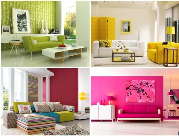
Color in the interior has a dominant value
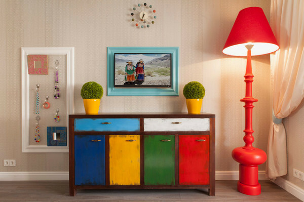
The color range of colors in the interior - the paramount question that determines the outcome of all of your design effort
The color wheel is always right?
Who and why invented the color wheel
The concept of the color wheel was introduced by poet and thinker IV Goethe in the late 18th century. In its circle included six colors, 3 of which were in the major (blue, yellow and red) and three additional (violet, green, orange).
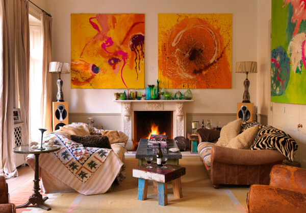
Selection of color depends on the area of a premise, its purpose, style, light conditions and personal preferences
A century later, the circle has been improved by the German physicist and chemist Wilhelm Oswald. Its color representation includes 24 colors.
Table colors William Oswald
| Circle Group Oswald | Colors |
| yellow |
|
| Red |
|
| purple |
|
| blue |
|
| green |
|
coupling scheme based on the color circle
-
monochrome scheme. It involves the use of light and dark shades of one color. Professionals often referred nyuansnymi such combinations.
Similar schemes for you if you are looking for a way to create a "pure" and quiet interior.
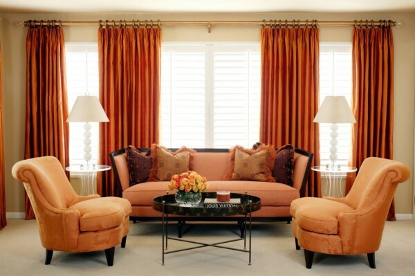
Monochrome color palette in the living room design
To the interior does not look monotonous, use live plants or metered quantity of bright accents.
- A similar scheme. The introduction into the interior of related colors that are adjacent on the color wheel. Such schemes provide rather elegant design, it is increasingly used in the classic style.
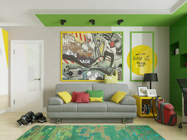
A similar scheme, combining standing next to shades of yellow and green
Diversify the interior can be achieved by varying intensity. To you received an order razbelennye and blackout shades, but remember the rule - the bigger the surface, the less should be saturated color.
- complementary scheme. Based on a combination of complementary colors. What we get as a result? Bright and modern interior in the style of pop art and fusion. If such a concept you like, remember that the two colors of the same intensity can only exist on the base and accent Rights.
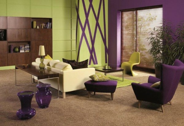
Do you want to own hands to create a bright interior? Choose complementary colors.
- Three-color scheme. In fact, the circuit is split complementary variant. Colors are selected on the basis of an isosceles triangle at whose vertices are located shades and group.
This solution is not suitable for small rooms, bedrooms and children's rooms. with time too active interior can upset.
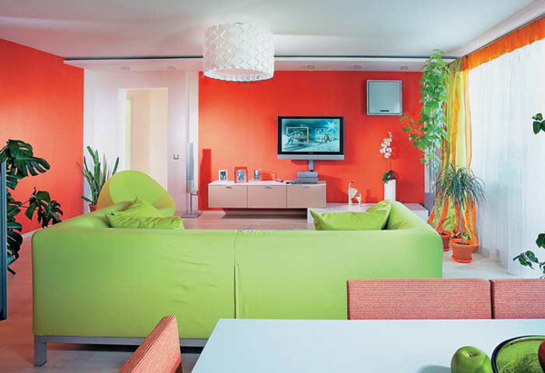
Restrained tricolor scheme
- double complementary. Dual compliment is formed from a combination of 2 pairs of complementary colors (four colors in total).
- Alternative complementary. The combination of the triad colors of the opposite (complementary) color.
- split complementary. The main color is complemented by the two adjacent and complementary.
- contrast. The interior colors are used, between which are arranged intermediate 3 hue.
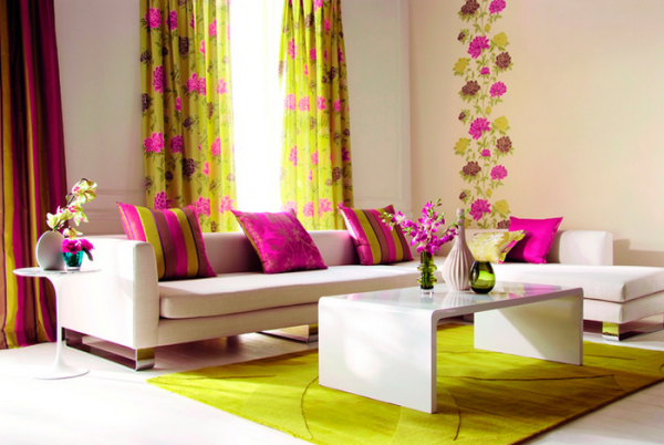
contrast scheme
By contrast scheme generally applicable primary and accent colors. For example, the duo of yellow and purple harmonious in the ratio of 1: 3, blue and orange - 2: 1, green and purple - 1: 1.
- neutral. Variant similar scheme using white, gray, black.
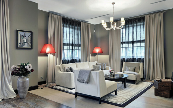
Remain neutral, do not forget about the accents
Do you have this selection shortcomings theory of colors? I think there is! And they derive from the virtues. The color wheel offers a relatively simple scheme, involving the use of 1-4 colors, but always whether such amount is sufficient to produce a harmonious interior?
To take on the color wheel, I advise those who are creating around the interior of the existing elements (furniture, decoration). It will help you to choose the flooring to the old wallpaper, tiles for the kitchen and curtains to your favorite couch.
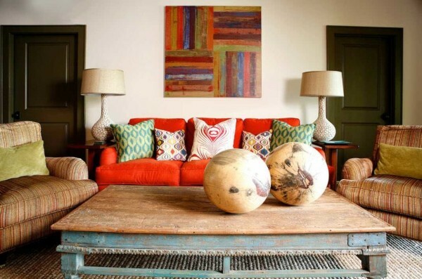
Not all interiors are subject to the rules of the color wheel
Seasons
The theory of the seasons belongs to American colorists K.Dzheksonu and G.Vattermanu. In studying the work of the artists they drew attention to the harmony and integrity of the paintings. But earlier artists only draw from nature, trying to convey the full range of colors of nature.
The interior, created based on the concept of the seasons, is to use colors that appear naturally in a particular time of year.
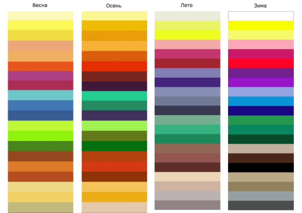
A palette based on the theory of the seasons
Each season contains all the colors, they only differ in richness and warmth. Spring and autumn are leaning towards warm colors with dominant yellow and red. Spring palette is different from the fall more tender and light tones, the latest I can rightly be called a more earthy.
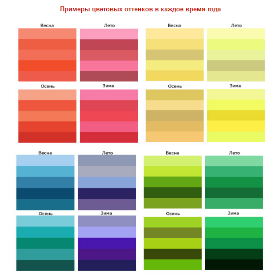
Instructions on the selection of shades Group
Winter and summer dominate cool tones. Summer is characterized by blue, winter - blue. Cool shades of summer seem a little faded, and winter sound clear and shrill.
Spring is coming, spring road!
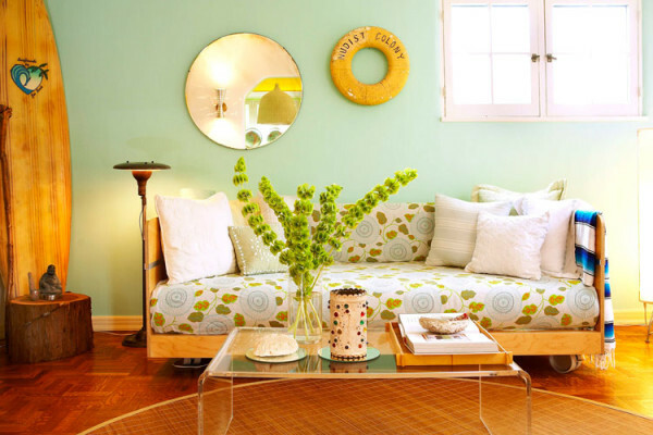
interior spring
Spring colors evoke a joyful and light mood. Due to the soft tones such combinations are often used in children's rooms and a small living room.
Textiles of the interior should be thin, smooth and drapes easily. In the matter of finishing the preference is to give a matte material with a fine structure.

Spring is in the details
If you prefer natural materials and wood chosen, even if it has a yellowish or slightly reddish tint inherent in softwood.
Metals should have a golden sheen, and stones - fine-grained structure and a warm tone.
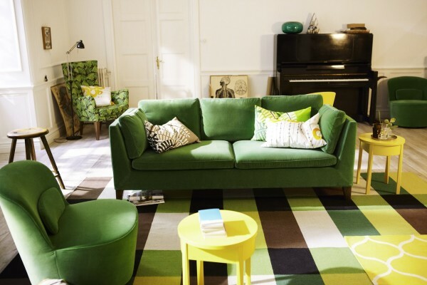
From spring interior breathes warmth and sunshine
When outside summer
Due to the summer paint the interior acquires coolness and elegance. The choice of textiles give preference to silk, satin, velor or fine flax.
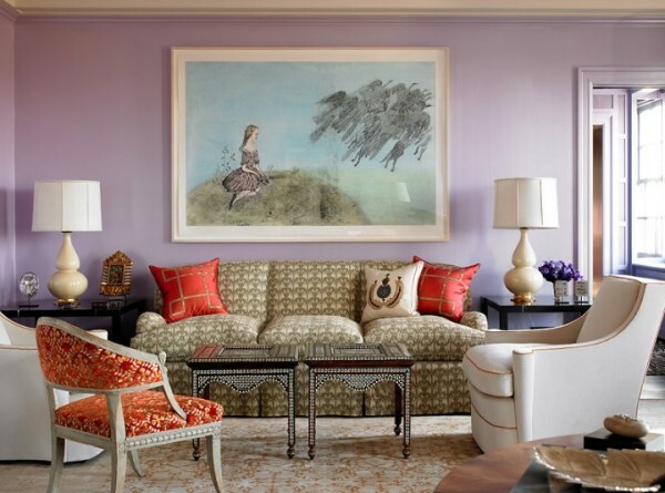
Summer coolness based on lilac
Decoration materials must be weakly structured texture or finish. The wood used is white, light yellow or olive midtone.
Metals usually silver with a slight sheen surface.
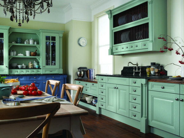
kitchen color selected on the basis of a summer palette
Put in a word about autumn
Autumn gives the interior warmth and depth. In the textile world for the autumn interior fit fabric with relief structure and a rough dressing, such as gabardine, calico, velvet and cotton.
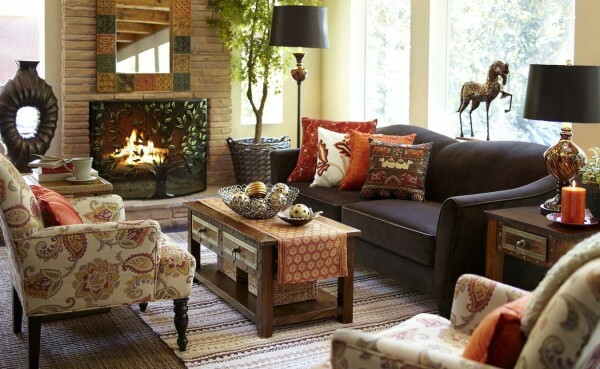
Cozy and late autumn
Finishing materials are obliged to have a matt polished or close to the natural structure. That rough plaster and embossed wallpaper and wood paneling.
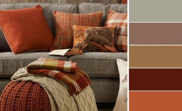
The palette for the classic interior
Look to natural wood or dark colors with reddish tint. Actual use of brass, copper and bronze with loose surface.
Winter Is Coming
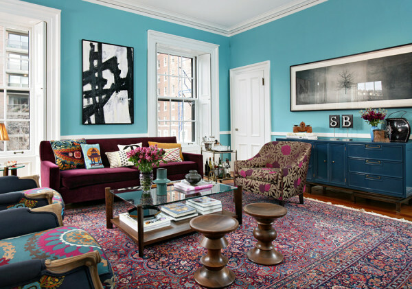
And because winter is not far off
Winter interiors characterized by harsh contrasts. Strengthen the winter range of help and metallic luster.
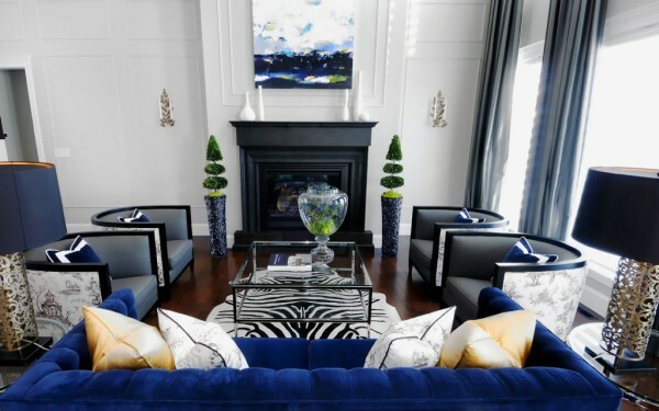
Winter - contrast and color saturation
Natural wood is practically not used in these interiors, but if you can not find an alternative solution, choose the darkest shade of reddish or olive midtone.
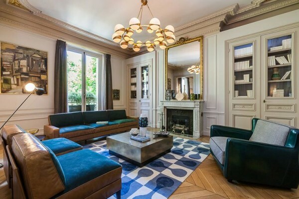
Bet on Blue
Unfortunately, this theory has a flaw. A lot of combinations and combinations requires the development of color flair.
"The picture of nature" method
If you are in the bins is not a designer diploma, the following scheme for you. This method does not have the drawbacks of the color wheel, and "seasons".
All that is required - the image of a natural phenomenon, it may be a flower, an animal, a full landscape. No matter how many colors may be in the picture, they will all be in harmony with each other. Nature does not make mistakes, there are no accidents!
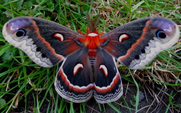
Butterfly turns, turns into a butterfly... into the interior of the living room
If you decide to use a snapshot method, be aware of the possibility of a combination of not only colors but also of textures, which often change the perception of a particular color.
Snapshot wildlife will tell you not only the possible combinations, but also proportional to the occurrence of colors.
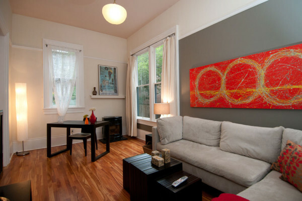
Selection of colors based on the image of a butterfly
Remove the color from the picture in several ways. The easiest - and Photoshop tool "eyedropper", which allows to determine the color of even the smallest part of the picture, adjust the intensity, and look at the "neighbors".
More laborious, but the creative method - the use of paints and pencils. This solution for people with artistic ability and ability to distinguish color nuances.
Successful and unusual combination of
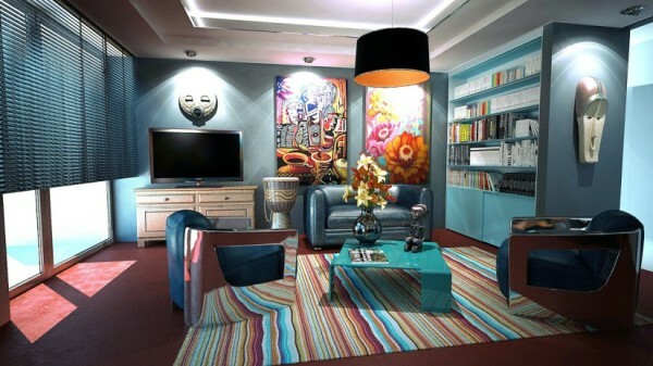
What is the price of individuality? The palette of colors and a pair of bright accents.
I offer you a selection of unusual combinations, which are often found in industrial design, fashion and art, but for some unknown reason I ignored in the interior.
Traditionally, color is divided into pale and bright, I propose to expand the classification and add two more categories - proven and unpredictable.
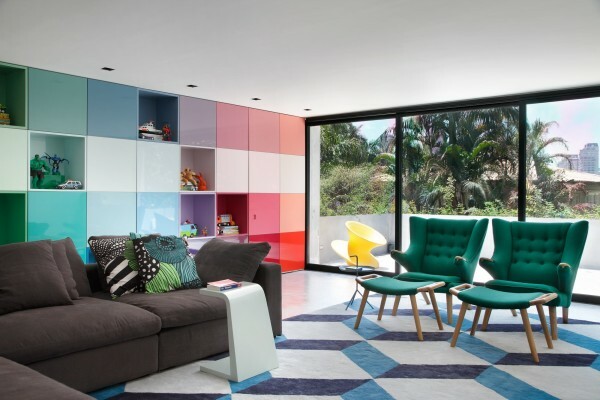
Multi-color interior
Among the proven I refer pleasant beige tones, I definitely know how I will react to it in a couple of years, and it is likely that I will want to diversify her soon.
But the unpredictable demand moral readiness, the color of maturity and desire to excel.
Yellow + pink
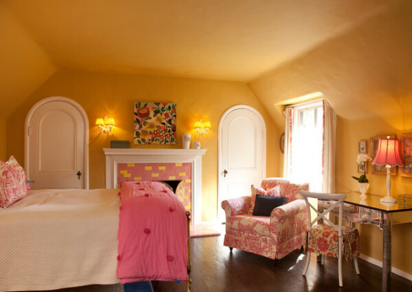
Pink and yellow in the nursery
Wow, yeah! I bet you have not seen any of these colors in the interior.
I'll teach you to control colors with no injuries and bitter sighing:
- Determine who is the chief, the colors may not be used in an equal amount.
- Select the intensity, guided by the surface area. The larger the object, the lighter the shade.
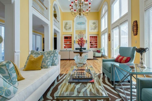
The combination for the living room
- The main surface - walls, beneath them will be matched by the furniture, textiles, doors, flooring.
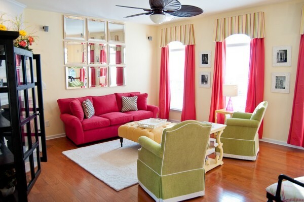
A little more saturated pink
- Remember the original floor space. Bright and dark colors bring in and out.
Blue + gray
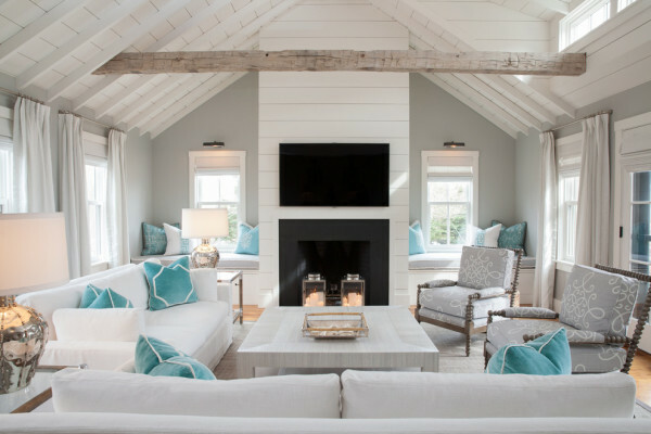
Pastel gray and blue
- Pick a few shades of gray and a blue tint. But the opposite rule does not work, it is unlikely you will be able to unite the team blue gray one.
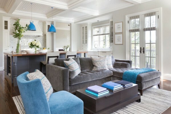
Tri-color interior
- Black blue and anthracite make more vivid and profound.
- If you do not put a goal to get a bright interior, pick up the blue and gray of the same intensity. Gray great harmony with indigo and cobalt.
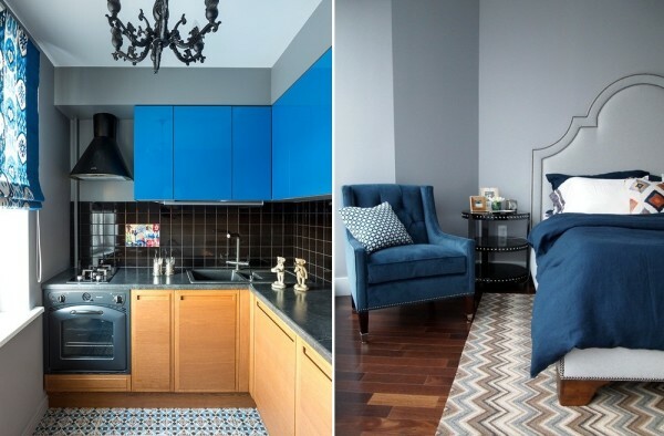
Options for the inclusion of natural wood
Green + Red
In my mind associated with the poppy field. Let's try to get a good color scheme?
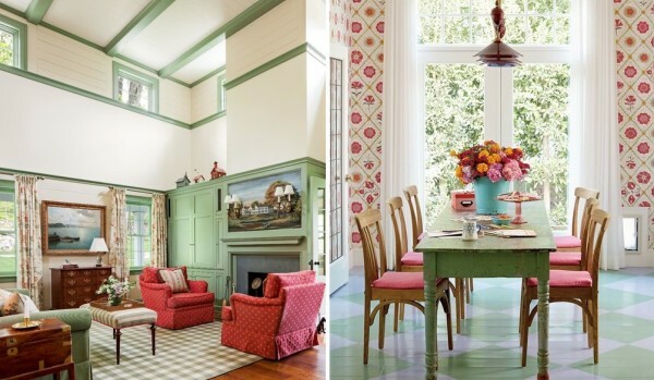
Shades of green and red
- The main is to stay green as more gentle and calm.
- Typically a single saturation and intensity does not work here. Rich red should be combined with a light herbal, minty green or pea.
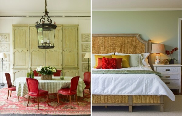
red accents
- Avoid open shades of red and green. The more complicated the color palette, the cozy interior.
- Red on large surfaces (curtains, floor, walls) should be included in the pattern, but the furniture is better to choose razbelennye shade of scarlet.
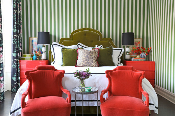
And what do you tell a green strip in the finishing of the walls?
Blue + Purple
Blue and Violet are rarely used as the core, may be called only exception bathrooms.
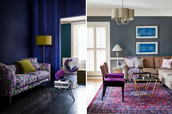
The charm of the duo of blue and purple
- "Gang" of saturated blue purple and viscous relevant only in rooms with sufficient space and light.
- If you are at the disposal of a modest area, the colors used in doses as accents on white or beige background.
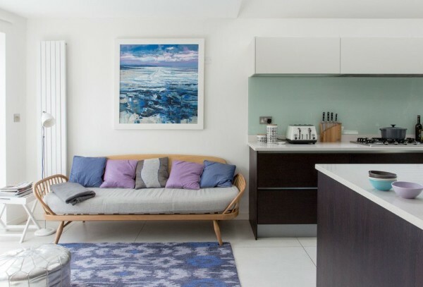
Summer interior with cornflower and lilac
Yellow green +
- Here we take the same tone. Excellent look with muted olive and pastel yellow, clear, bright yellow and intense green.
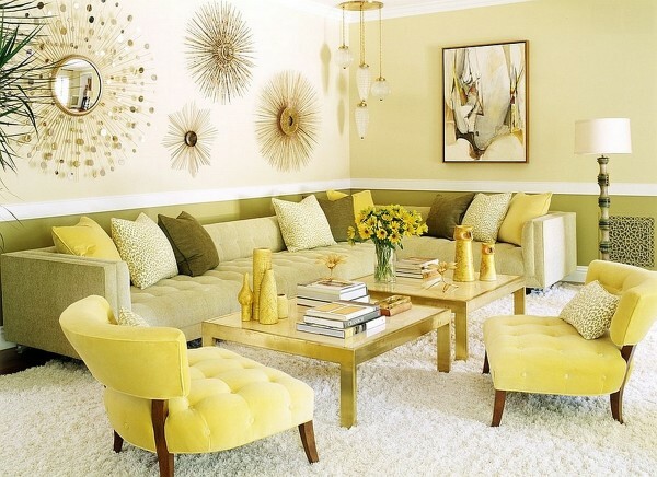
Classic on the basis of a pale yellow color and a pear
- Actively implement designs and prints. You are tired of bright walls? Do not rush it repaint, better grasp the sponge and stencil.
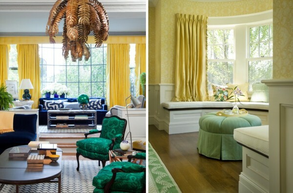
Slightly brighter green
Burgundy red +
- The first rule of the duo - the maximum density. To the interior does not look boring and bland, use thick and rich colors.
- If the red and burgundy all did not want to join in the interior, dilute this hot group gray.
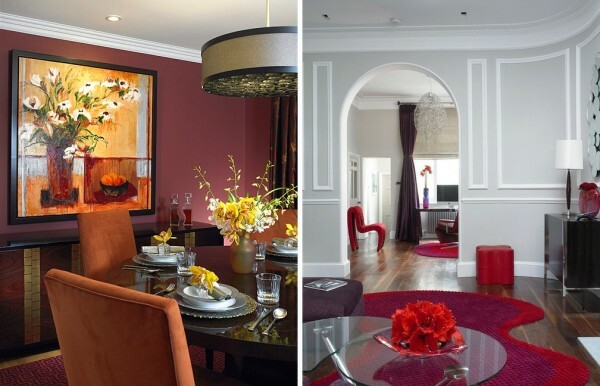
They are similar, yet so different
From Moscow to New York
And now I offer you some ready-made interior in an unusual color combination, which I found in different parts of our planet.
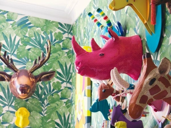
Colors! More color!
New Zealand and almost jungle. 270 m² found all over the place, each room of the house has a wonderful range of colors. Here and wallpaper with floral patterns and rich colors blue and yellow tiles playful.
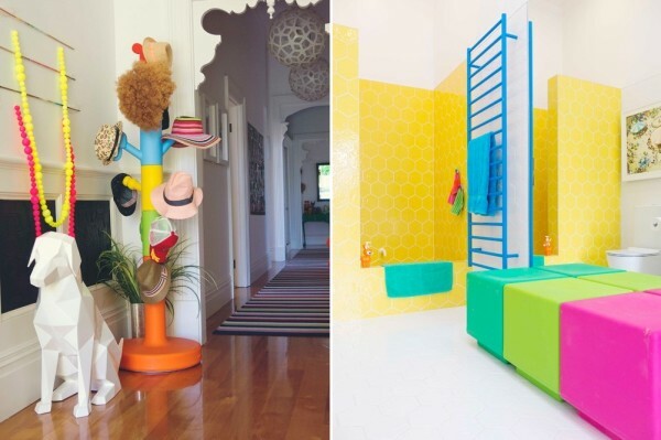
And you decide to New Zealand brightness?
Russia and graffiti on concrete. The apartment is located in the heart of Moscow. The starting point of the interior began to graffiti, diluting the grayness of concrete walls.
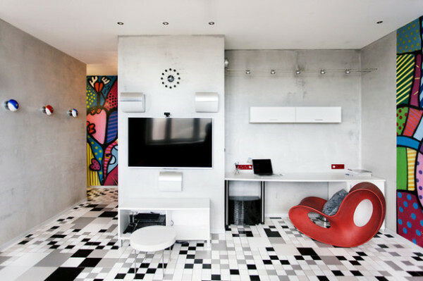
Russian graffiti
Germany in soft blue tones with bright colors in accents. Next stop - the western part of Berlin. Here, in an apartment on the blue walls found their refuge incredibly vivid pictures that probably had collected all the color palette.
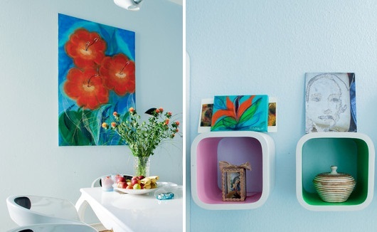
restrained Germany
Spain and a bit of magic transparent structures. Light is worthy of a separate article, he ligaments with color and texture can change the interior beyond recognition. To understand this, just look at the photos of the interior. Central to it was the colored transparent plastic furniture.
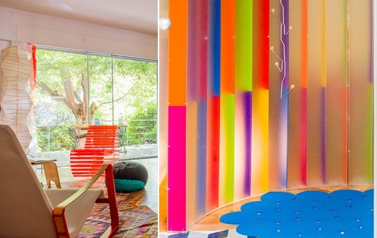
Spaniards have always loved bright colors
bright France. All very simple - white and gray as a foundation, juicy yellow and red for contrast. Center of concentration, not only the brightness of steel canvases, but the door jambs painted in vivid colors.
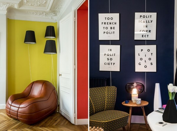
Here - blue, and there - red - bright interior concept in French
Scotland and a house with colorful rooms. At such a riot of colors will be decided, not everyone in the house was a place the blue living room, hallway fuchsia, pink beige kitchen and bedroom.
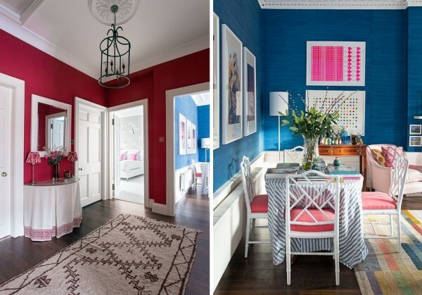
Yes, it's Scotland, and you no cells and bagpipes
Gilding and gloom in Denmark. Dark shades and shine of gilding - a combination of timeless and fashion. Background for multiple art objects become dark walls marked graceful ornament.
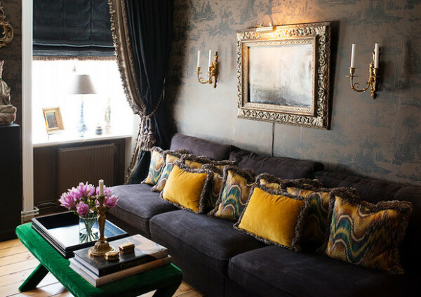
We turn to the dark side
Australian turquoise with red accents. The interior in the style of the Victorian era is realized in a very unusual palette. On the basis of turquoise placed accents of pink and red. This project allows us to prove that even the classics suffers competent deviation from the rules.
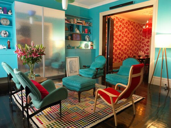
Classic colors in nonclassical
Summing up
Color affects our mood and even health, changing the visual perception of space, highlights the selected style shows your life vector. Someone will be in neutrality, some cling to the lovers of color and brightness, the main thing - your interior should be cozy and comfortable for you.
To talk about the color can be infinite, picking up hundreds and even thousands of combinations, I suggest you watch the video in a surprisingly useful This article and move to the comments, where it can break out in earnest color battle, you do not want to miss all the interesting?
Seen God artist, otherwise, why so many flowers ( "A Beautiful Mind").


